The Art & Science of Color by Aman Than
Mar 06, 2025 | Carpet One Floor & Home
Written by Aman Than | Design by Aman Than Interiors | Photography by Mike Chajecki
Color theory is the backbone of interior design, a sophisticated interplay of art and science that influences how we experience our spaces. Color transforms how we function and feel in a room, with new meanings expressed in subtle variations of warm, cool, lighter, or darker iterations of a single color. That’s why understanding the impact of color and how to use it in a home is critical to good design.
The Basics of Color Theory
At its core, color theory explores how colors interact. The color wheel is a great visual tool, illustrating the relationships among primary, secondary, and tertiary colors. I recommend using one to help clarify the following concepts.
There are three primary colors: red, blue, and yellow. They cannot be created by mixing other colors, and all other colors are different combinations of these three, plus black and white.
Color theory also involves the concept of color temperature. Warm colors appear on the red-orange-yellow side of the color wheel, while the cool side leans into blue, green, and purple. Warm and cool colors can be true colors or contain undertones of yellows or blues, which gives them their warm or cool characteristics.
Pro Tip: Mixing warm and cool colors can create visual conflict. Stick to a consistent warm or cool color scheme to maintain harmony and balance throughout.
Psychological Impact of Color
In my professional experience and as proven by science, color can have a profound psychological effect, influencing mood, behavior, and even physiological responses. This understanding is critical in my design work, where the goal is to create a specific feeling or atmosphere.
- Red is often associated with energy, passion, and excitement. It’s a stimulating color that can increase heart rate and adrenaline flow. Red is ideal for social spaces like living rooms or dining areas, where energy and interaction are encouraged.
- Blue is known for its calming and serene qualities. It has the potential to lower blood pressure and slow respiration, making it perfect for bedrooms and bathrooms, where relaxation and tranquility are the primary objectives.
- Yellow symbolizes happiness and optimism and can bring warmth and cheerfulness to a space. However, it should be used in moderation, as excessive yellow can evoke feelings of anxiety.
- Green represents nature and renewal and is balanced and refreshing. It’s also quite versatile and can be used in almost any room to create a soothing environment.
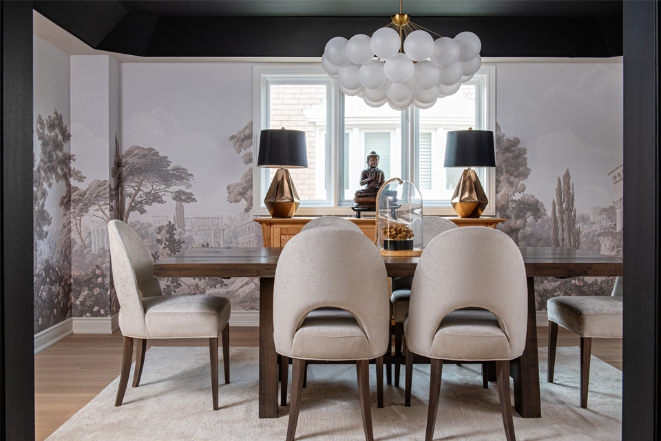
- Purple is often associated with luxury and creativity. It brings sophistication and drama to a room, making it ideal for areas where a touch of elegance is desired, such as dining rooms or master bedrooms.
- Neutral colors such as whites, grays, and browns are adaptable and form the foundation of many interior designs, including my own. They provide a backdrop that can be “dressed up” with accent colors, which is essential for creating a balanced, cohesive look.
Color Theory in Practice
I rarely view color as a singular element. It’s the combinations of different colors that create the desired vibe in a room.
Monochromatic Color Schemes: Monochromatic color schemes carry a certain mystique and have long been loved for their elegance and simplicity. A monochromatic palette features one color in various shades (add black), tints (add white), and tones (add gray). I love this application for creating a cohesive, soothing look ideal for contemporary and minimalist interiors.
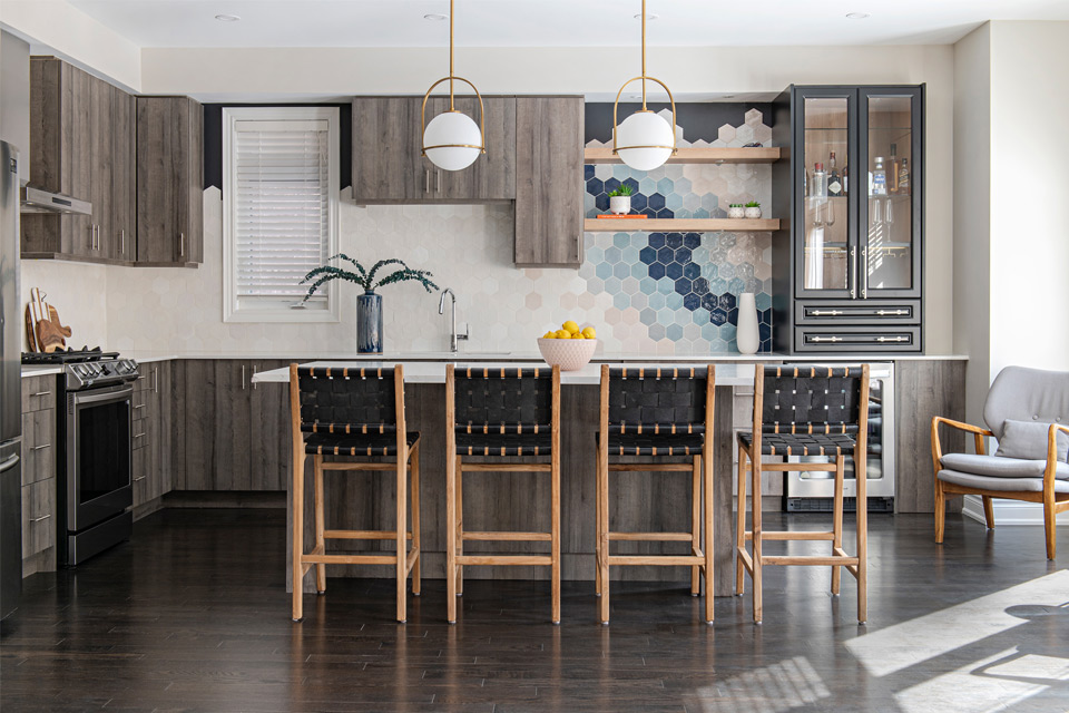
Analogous Color Schemes: Analogous colors such as blue, blue-green, and green appear next to each other on the color wheel. Analogous palettes are pleasing to the eye and suitable for spaces intended for relaxation and comfort.
Complementary Color Schemes: Complementary colors are opposite each other on the color wheel, like red and green or blue and orange. These combinations create a vibrant and dynamic look, making each color appear more intense. This scheme works well for accent walls or focal points.
Triadic Color Schemes: Triadic color schemes use three colors evenly spaced around the color wheel such as red, yellow, and blue. These vibrant and balanced colors offer a playful yet harmonious look, excellent for children’s rooms or creative spaces.
The 60-30-10 Rule for Color in Interior Design
Understanding the basics of color makes it easier to work with. Much like the color wheel itself, using color is simplified with a simple visual formula known as the 60-30-10 rule. A dominant color occupies 60 percent of a room’s visual area, 30 percent by the secondary color, and the final 10 percent by the accent color. This trio of colors can be complementary, contrasting, or even monochromatic, depending on the look you’re going for.
The secret to success is balance. Stand at the entrance of the room and ensure your colors are distributed evenly from floor to ceiling. Floors are an overlooked place to add pops of color, but they are very effective because of the wide area and the unexpectedness of the application. Depending on how committed you are to your chosen color palette, an area rug can satisfy temporary color cravings, or a colored tile, stone, or wood stain can become a stunning focal point in the room.
The Role of Lighting in Color Theory
Lighting is key to color perception. Natural light changes throughout the day, affecting how colors appear. Artificial lighting, including the type (incandescent, fluorescent, or LED) and temperature (warm or cool), can also alter the appearance of color. Warm lighting enhances reds, oranges, and yellows, while cool light emphasizes blues and greens.
There’s more to color than meets the eye. In fact, its impacts are largely subliminal. You’re usually not quite sure why a room makes you feel a certain way—it just does. The next time you experience this phenomenon, focus on the color palette. You just might find the answer in plain sight!
For more articles like this, check out the latest issue of The Beautiful Design Made Simple—your go-to guide for expert design tips and flooring inspiration. From practical advice to the latest trends, our blog is here to spark your creativity and help you bring your vision to life. Thinking about a home transformation? Explore our carefully curated selection of stunning, durable flooring options online, and let us help you create a space you’ll love for years to come. We’re here to guide you every step of the way.